I decided to write this tutorial in regards of the awful lighting I see in most maps, and because lighting is my favourite part of map making.
The problem is that most people don't even think about their lighting, in the following I try to give some hints. It's not the ultimative lighting,
it is what I like. This tutorial requires that you already know how to use your tool (UnrealEd), I won't explain that.
1. Basic Lighting
As example I use this room (unlit in this pic). You better open one map you
are working on at the moment and try out the things I'm gonna try to explain.

Newbies use to fill their maps
with default light actors (hold down 'L' and click around in the map) which
mostly looks like this.
This is how NOT to do it.

And please use light sources. Nothing
looks worse than a map without light sources/lamps.
Open the light actor properties.
The basic options you need to know are marked red.
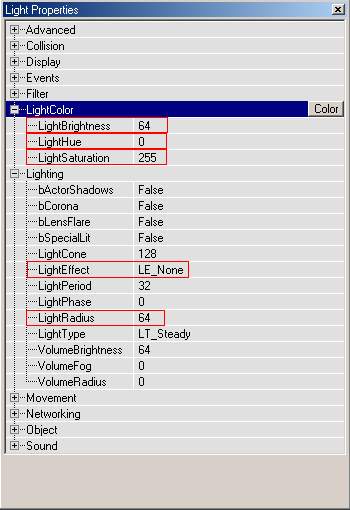
A saturation of 255 means that
the light color is white, what I NEVER do.
A radius of 64 is mostly way too big, and the default brightness of 64 is
not bright enough.
Good lighting is about good contrasts
-> warm colours -cold colours; sharp shadows-blurry shadows;....and so on.
You should have a healthy mix of all.
Now let's add lights to an empty map
Place them only next to a lamp. Let's call it LOCAL LIGHT!

I've given the lamp a warm colour
(25=brown). Don't use too low saturations (0-48) or it will be more colourful
than a gayparade, but keep them under 200, or they will be white again.
Brightness shouln't be higher than 200 or you will get a greening effect,
as in many engines in the Unreal engine lights use to turn green when they
are too bright.
Now we have a warm light with a small radius and a high brightness. A good
contrast would be a cold light with a high radius and a lower brightness.
It's the so called GLOBAL LIGHT!
The global light does NOT need light source, only local lights need one.
But in this example I use the lamps on the ceiling as a light source.
I suggest using low saturations (high actually, in the unreal
engine the saturation numbers are upside down) for
Global Lights.
In this pic its 170, but 64 looks much better IMO.
Now it may look dark in the 3d editor window. But that's fine, ingame it's
always brighter.
You just have to get used to that.

The next problem: the blue light
is supposed to be given off from the big lamps on the ceiling, but they don't
look like giving off light because the brightness is too low.
So you place another light next to the lamps.

They have to have the same colour
settings like the other light, but a higher brightness and a very low radius,
that they only lit the lamps, nothing else.
Now compare that to the first lit pic.......much better I guess. Don't
be affraid that it is too dark, in the editor it's always too dark, but ingame
it's ok.
In the next room you can use a big warm light and small cold lights, otherwise
it will look the same overal. Go gr4zy with that stuff.
Don't use colors like green or purple, their destination is to look gay, and
so will your map. =)